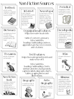
 While I would love to share this, I don't feel quite comfortable doing that, as it is very closely based on this pin on Pinterest. It is something that the pinner purchased. Although it covered all the types of non-fiction I need to touch upon, there were things I needed to change to make it work for my classroom. First, I included "The Internet" instead of "digital media." Really, this was more for the familiarity/vernacular of my students than anything. Next, the definitions came out of the dictionary I use in my classroom; this way, the information is kept at a higher level for my older students. Additionally, although I included images, I wanted the written info to be the focus and the images a supporting piece. I also included a few items we discuss in my classroom that were not on the original, such as subtitles and subheadings. Finally, I made sure there was a place along the middle for folding. I will have my students glue this into their reading composition books. The page is too large, but I did not want to reduce it. There is a lot of info here, and it needs to be easy to access. They'll be able to fold it where the crease won't interfere with reading the words. Still, for younger grades, purchasing the preexisting one makes sense, and thus, I don't feel right about sharing mine for free.
However, if you want to make your own, I can tell you what I did. The "books" are simple shape and line art. The definitions come from a source my class uses and trusts; I highly suggest that the definitions take into consideration the age of your students. If the wording is too high, the kids won't get what they need from it, and if it is too low, it talks down to them and lessens its perceived value. The images are from Microsoft--the ones that come with the Office software. I built my page in power point, as it gives me the most freedom to manipulate things; all I had to do was click 'insert clipart,' and search for images using keywords. I reduced their size to fit and gray-scaled the images for copying.
This blog is just my little space for sharing lessons I've developed for my classroom and ideas that inspire my teaching.
Tuesday, July 31, 2012
Non-Fiction Insert for Reading Journals
 While I would love to share this, I don't feel quite comfortable doing that, as it is very closely based on this pin on Pinterest. It is something that the pinner purchased. Although it covered all the types of non-fiction I need to touch upon, there were things I needed to change to make it work for my classroom. First, I included "The Internet" instead of "digital media." Really, this was more for the familiarity/vernacular of my students than anything. Next, the definitions came out of the dictionary I use in my classroom; this way, the information is kept at a higher level for my older students. Additionally, although I included images, I wanted the written info to be the focus and the images a supporting piece. I also included a few items we discuss in my classroom that were not on the original, such as subtitles and subheadings. Finally, I made sure there was a place along the middle for folding. I will have my students glue this into their reading composition books. The page is too large, but I did not want to reduce it. There is a lot of info here, and it needs to be easy to access. They'll be able to fold it where the crease won't interfere with reading the words. Still, for younger grades, purchasing the preexisting one makes sense, and thus, I don't feel right about sharing mine for free.
However, if you want to make your own, I can tell you what I did. The "books" are simple shape and line art. The definitions come from a source my class uses and trusts; I highly suggest that the definitions take into consideration the age of your students. If the wording is too high, the kids won't get what they need from it, and if it is too low, it talks down to them and lessens its perceived value. The images are from Microsoft--the ones that come with the Office software. I built my page in power point, as it gives me the most freedom to manipulate things; all I had to do was click 'insert clipart,' and search for images using keywords. I reduced their size to fit and gray-scaled the images for copying.
Subscribe to:
Post Comments (Atom)
BTW, if anyone is wondering if there is a reason for things placed wehre they are, there is! I tried to keep the most commonly used things in the upper left, working out to the upper right and lower left. The least used (by my students) are in the lower right. Hope that makes sense!
ReplyDeleteLove this! Very creative!!!
ReplyDeleteThe value in this is the process, making the end result more meaningful. Thanks for sharing!
ReplyDeleteThis is great. Thankyou for sharing :)
ReplyDeleteI would love a copy! This is awesome.
ReplyDeleteThanks for the love of sharing I am very happy with all of them..much love... God bless you more.
ReplyDeleteI've been deeply indulged in reading journals and non-fiction inserts lately, which has really enriched my academic understanding, but it also took a toll on my study time for other important tasks. Since my schedule was getting overwhelming, I decided to get some help regarding my HESI exam. I reached out to Take My Online Class US with a request to take my HESI exam, and it really helped me balance everything more effectively.
ReplyDelete